Problem
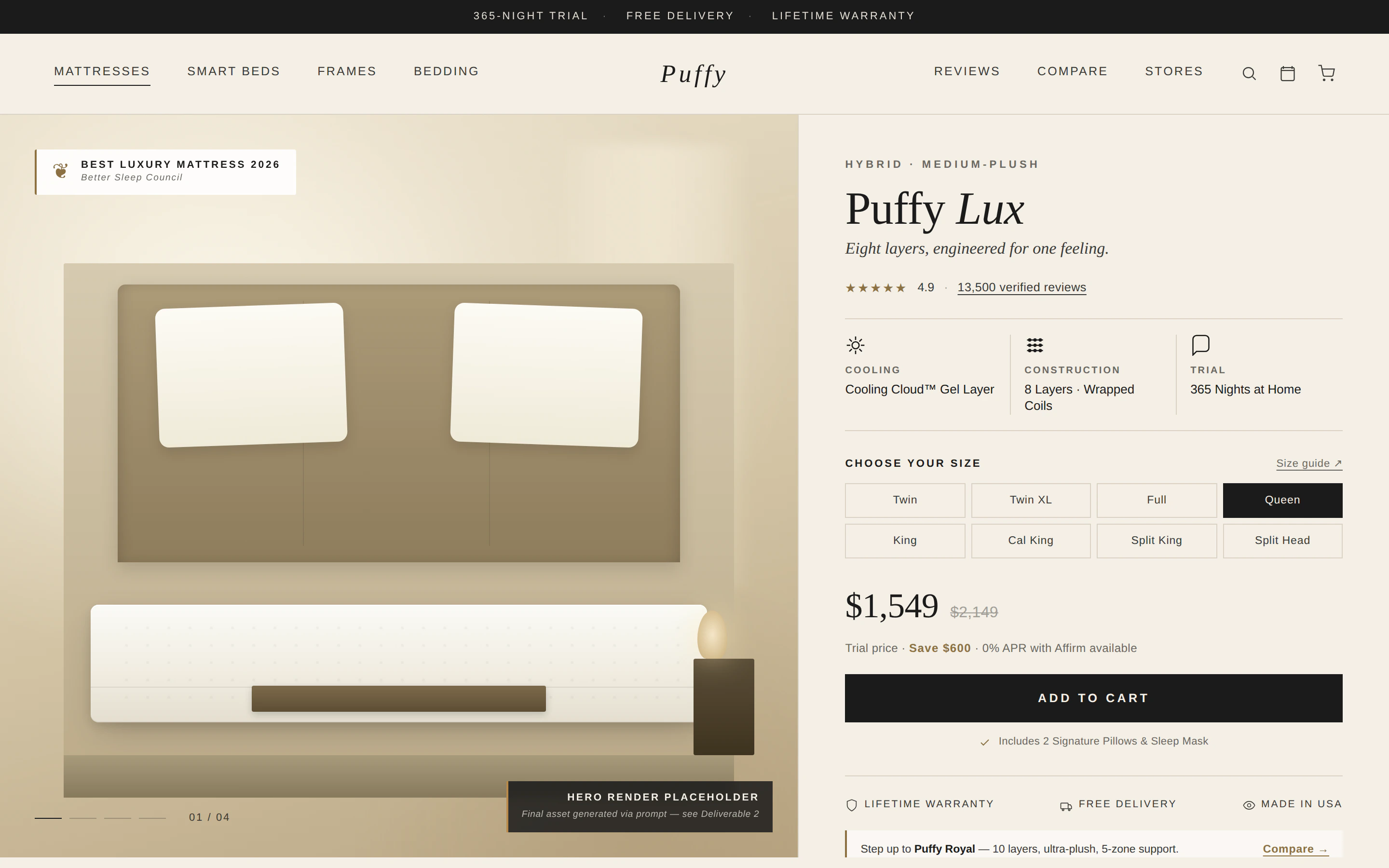
A $1,549 mattress is a high-consideration purchase, and the page was making it harder. The starting first fold looked polished, but it was built from familiar AI-generated luxury patterns, and it never showed the actual product.
I audited it against a catalogue of AI design patterns. Each one is a signal to question, not an automatic error:
- A badge above the headline, adding a second attention target instead of proof.
- A cream-and-beige palette and soft spotlight halo, creating mood without explaining anything.
- Three identical icon tiles, giving every benefit the same weight.
- Tiny "01 / 04" labels, numbering with no real sequence.
- A "hero render placeholder" where the mattress should be.
- Eight equal size buttons with no dimensions, and the same three promises repeated twice.
The real cost: ten things competing for attention, and no clear path from "what is this?" to "add to cart".
How I fixed it
Research before pixels
Three inputs shaped every decision: buyer research on luxury-mattress questions, a technical audit (accessibility, responsiveness, implementation risk), and a UX critique of hierarchy and cognitive load. Then I aligned everything to Puffy's own brand guide.
One decision path
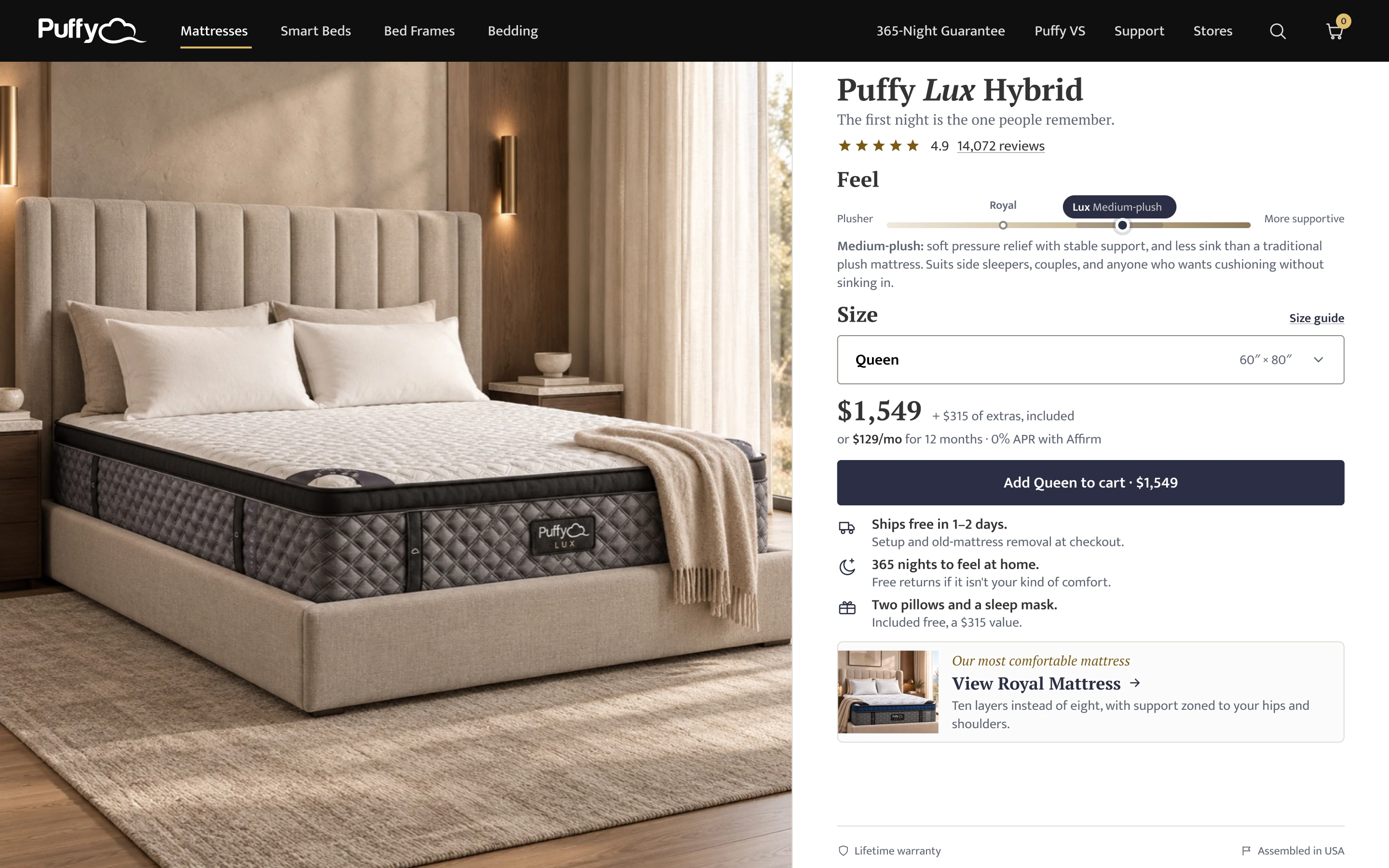
I reorganised the first fold around the order a buyer actually thinks in:
- Product
- Feel
- Size
- Price
- Reassurance
- Add to cart
Why this, not that
Chose
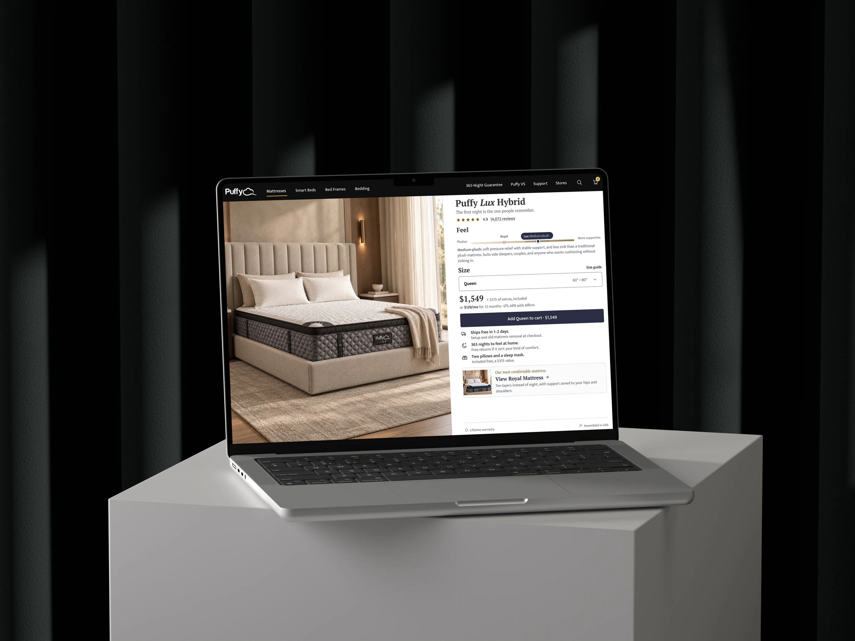
Show the mattress, uncovered
NotA lifestyle shot with the bed made up
Shoppers can't judge a mattress hidden under a duvet. The new scene keeps most of the top visible, so the quilting, edge and side profile carry the $1,549.
Chose
A Feel scale
NotComfort adjectives, or a quiz
Comfort is the hardest thing to sell online. Lux sits on a scale between Plusher and More supportive, with Royal as a reference point, and one line says who it suits.
Chose
One size selector with dimensions
NotEight equal buttons
A single control with "Queen, 60″ × 80″" removes a dense grid and puts the size next to the number that matters.
Chose
A CTA that confirms the choice
NotA generic Add to cart
Add Queen to cart · $1,549 repeats the size and price back at the moment of commitment.
Chose
The upgrade after the main path
NotTwo journeys competing
Royal is still visible, but only after the Lux decision is complete. An upsell that doesn't weaken the main sale.
Reassurance moved to where hesitation happens: delivery, the 365-night trial, free returns and the included extras now sit directly under the price and the button.
Solution
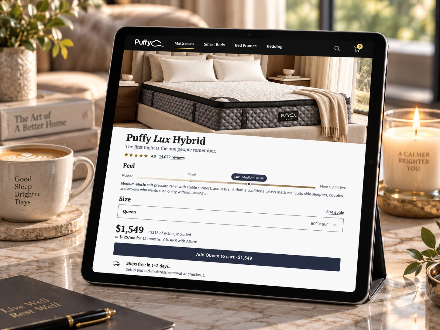
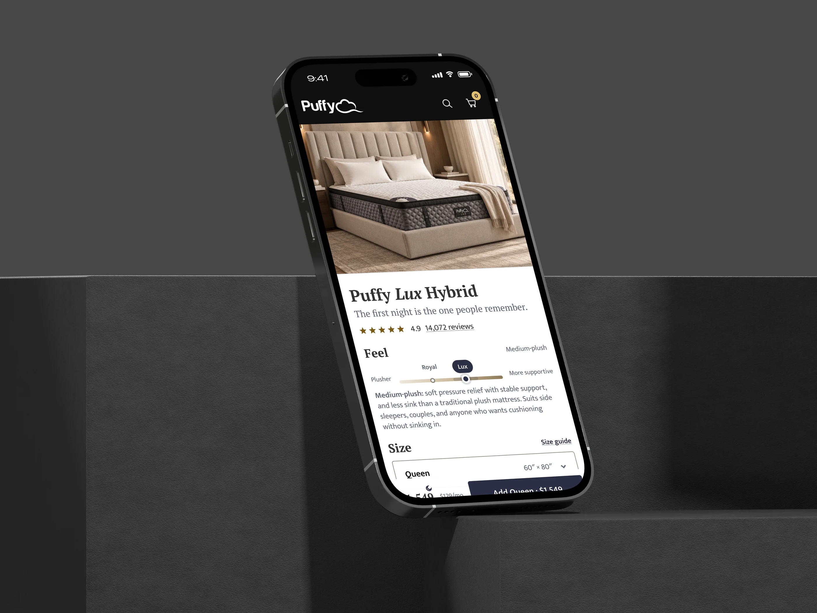
One journey, three screens
Responsive here means more than fitting the layout. Desktop, tablet and phone keep the same order, so a buyer never has to relearn the page. On mobile, the price and CTA stay in reach at the bottom of the screen.
Tablet
Mobile
An image system, not one image
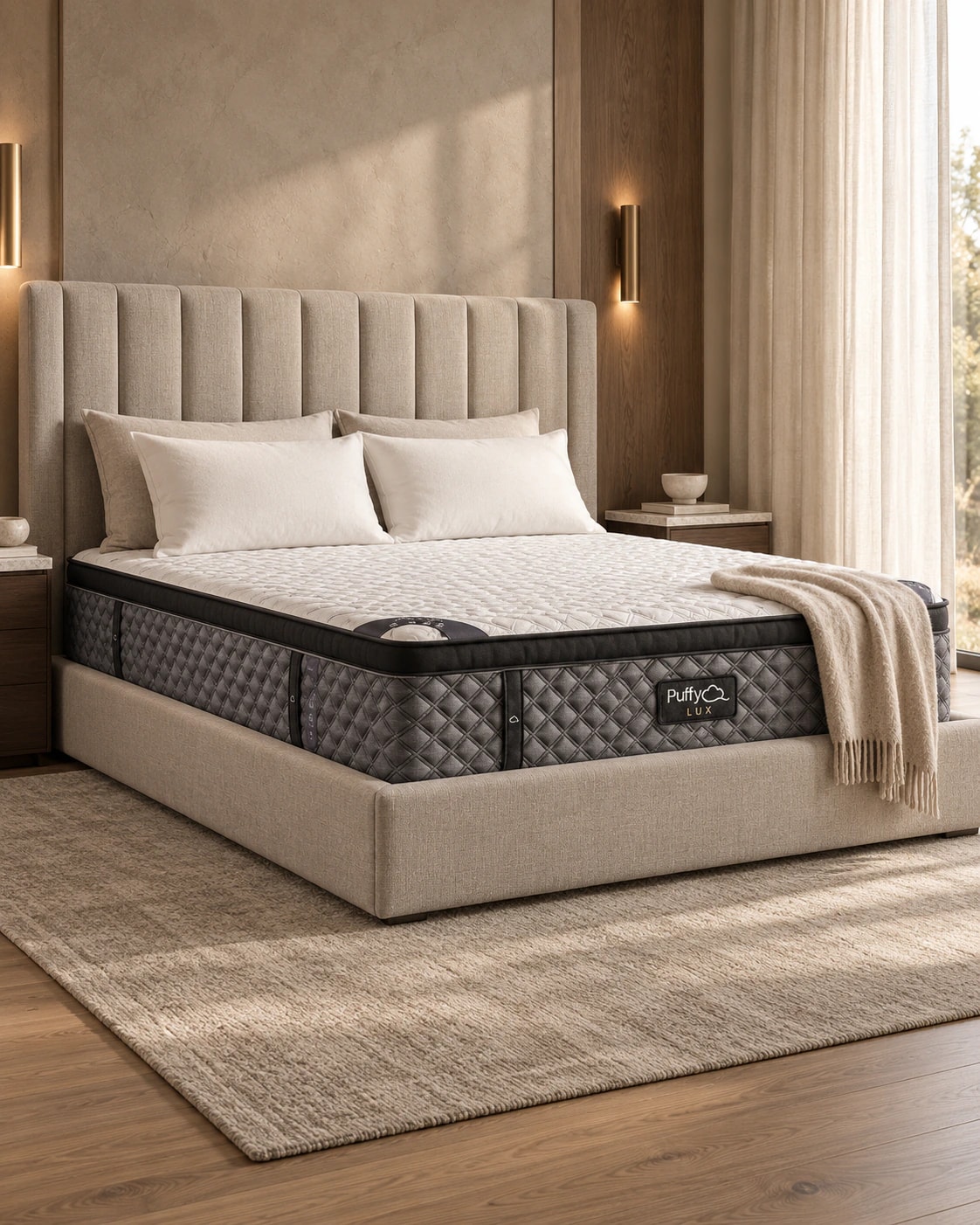
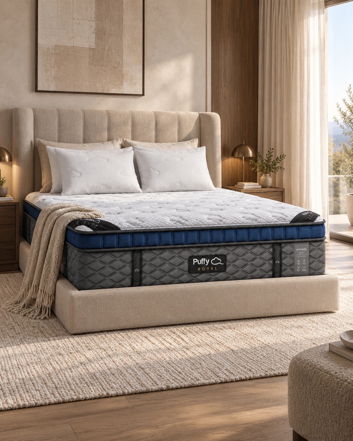
I wanted every mattress in the range to look like the same photoshoot. I wrote one detailed prompt, then turned it into a template: the designer swaps the product name, the key benefit, and a reference photo. The reference is the source of truth. The prompt changes the room, never the mattress.
Lux
Royal
Two directions, one deliberate choice
I never take the first output. I built two directions with different AI tools and judged them against the brand, product clarity and use of space. Option A left the lower half of the fold empty. Option B gave the product more presence, so it won. That was a design judgement, not a test result; I'd confirm it with add-to-cart rate and CTA interaction.
Option A
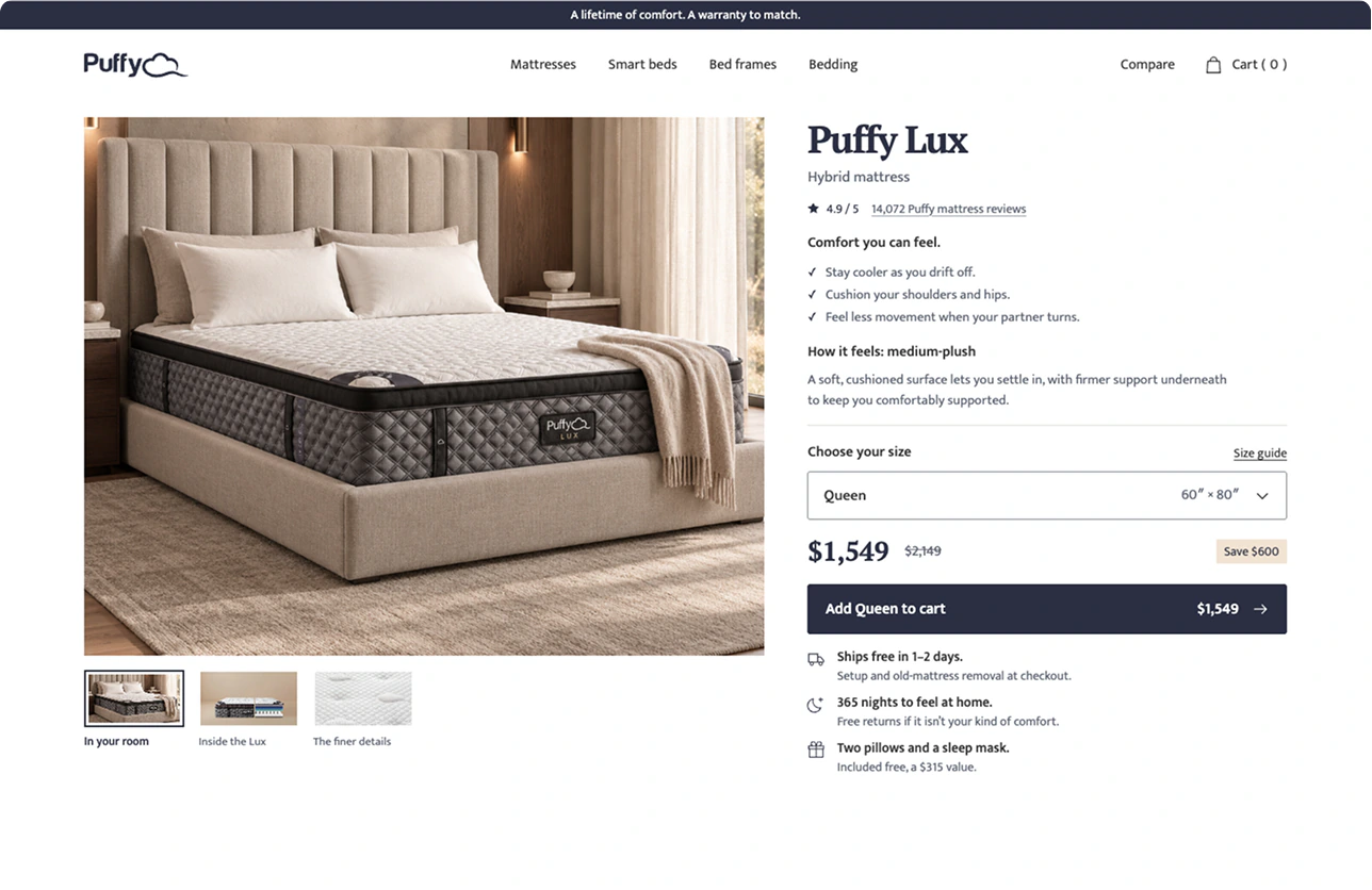
Option B · chosen
To keep future pages on-brand, I wrote a Guidelines.md that any AI tool can read: fonts, colours, spacing, CTA rules, image direction and product-fidelity rules. With a short handoff brief, a designer can carry the system to Cloud, Royal, Monarch and Legacy without starting from a blank prompt.
Results
This is a concept, so the results are hypotheses I would validate after launch, not claims:
- Higher purchase confidence: the product, comfort guidance, dimensions and reassurance answer the questions buyers ask before paying.
- Stronger perceived value: construction, feel and setting justify $1,549 better than generic luxury styling.
- Better conversion and upgrade exploration: one dominant action reduces friction, while the Royal path creates an upsell without competing.
I'd measure it with add-to-cart rate, purchase conversion, size-selector interaction and Royal comparison clicks, plus short interviews about whether people understood how the mattress feels.