Problem
Nadia leads a regional soft-drinks producer: brands, bottling plants, trade customers, and demand that swings with the seasons. Her question on Monday morning is not "what happened in a warehouse?" It is are we winning, where is growth coming from, and what needs me?
Typical executive dashboards answer with a wall of grey cards. They feel cold, interchangeable, and tiring, which is the opposite of a fizzy drinks brand.
How I fixed it
Picking the five signals
Design targets, not measured results.
Every number earned its place by answering a question Nadia would ask next:
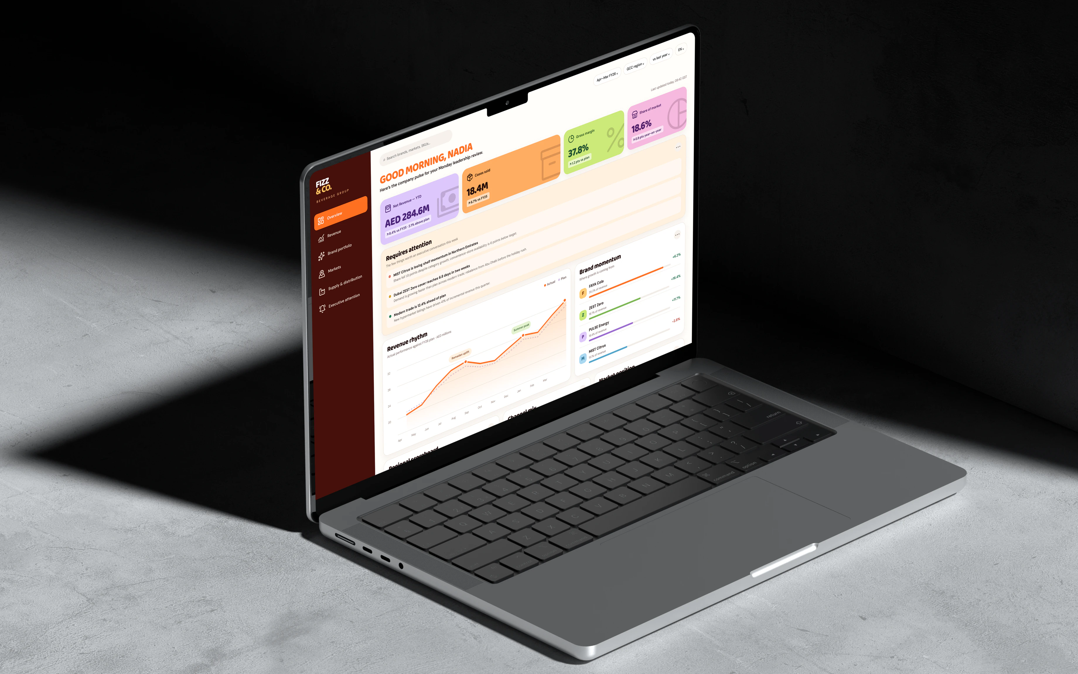
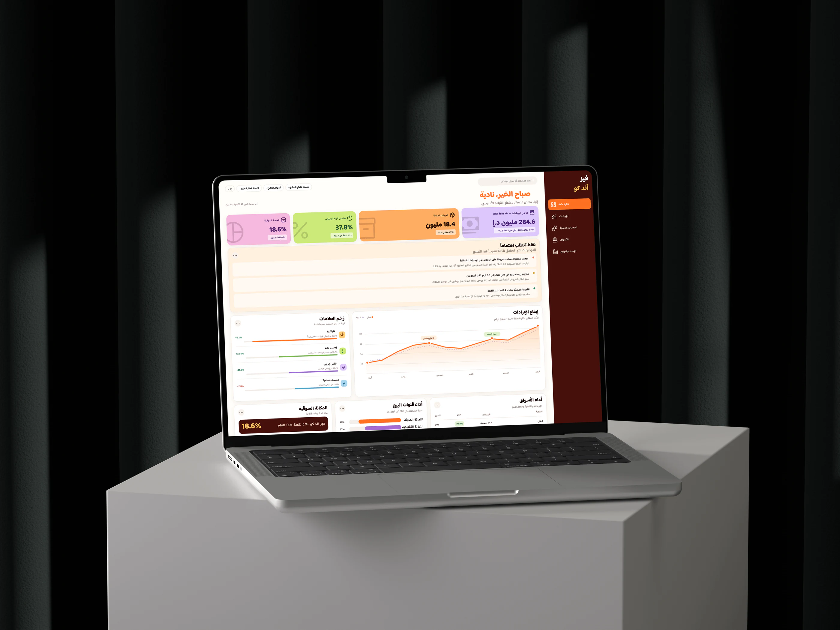
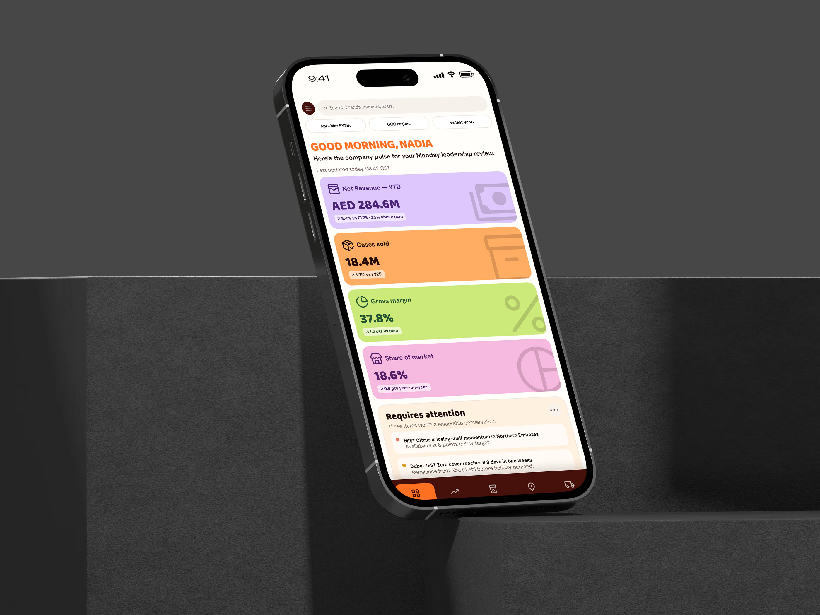
- Revenue, cases sold and gross margin form the commercial triangle. Showing all three stops anyone celebrating growth that is unprofitable or volume that is badly priced.
- Market share and distribution coverage add the outside view. Revenue can grow while relevance falls.
- Brand momentum and a regional scoreboard show which bets are working and where to step in.
- Demand forecast and supply health turn a sales view into a readiness view, because soft drinks are seasonal.
Why this, not that
Chose
A playful, product-app look
NotThe safe, grey admin template
Soft, oversized KPI blocks and a friendly display face lower the barrier to a dense performance conversation. It matches the brand, and the rest of the page still tightens into ranked lists, tables and alerts.
Chose
Three executive conversations
NotAnother scorecard
Requires attention turns signals into issue, implication, and suggested posture. Nadia reads what to discuss, not just what moved.
Chose
Desktop first, mobile as a decision stream
NotShrinking the desktop
The Monday review is a comparison task, often on a shared screen, so desktop leads. On mobile the same content stacks into one vertical stream for checking the pulse between meetings.
A colour for every signal
Deep cola burgundy anchors the navigation. Orange brings energy and action, while lilac, lime and pink separate the major signals without noise. Baloo 2 gives the numbers personality; DM Sans keeps labels calm. The Arabic build pairs Baloo Bhaijaan 2 with Noto Kufi Arabic to keep the same warmth right to left.
Solution
Results
A concept with fictional business data. What it proves is a point of view: an executive surface can be serious about the numbers and still feel like the company that makes them.
The first thing I'd measure with a real leadership team is time to answer three questions: are we on plan, which brand is slipping, and where do we act this week.