Problem
Cashi is a digital wallet concept for Sudanese users, with a strong focus on young people. The constraints are unusual and strict:
- Many users have limited digital experience.
- Literacy levels vary, and some people rely entirely on icons and images.
- Connectivity is unreliable and data plans are expensive.
- The home screen has to fit above the fold, with no scrolling.
A typical wallet home, with a dense grid of ten or more service tiles and text-heavy menus, would fail every one of these.
How I fixed it
I designed for recognition over reading. Every decision was tested against one question: could someone use this without reading a single word?
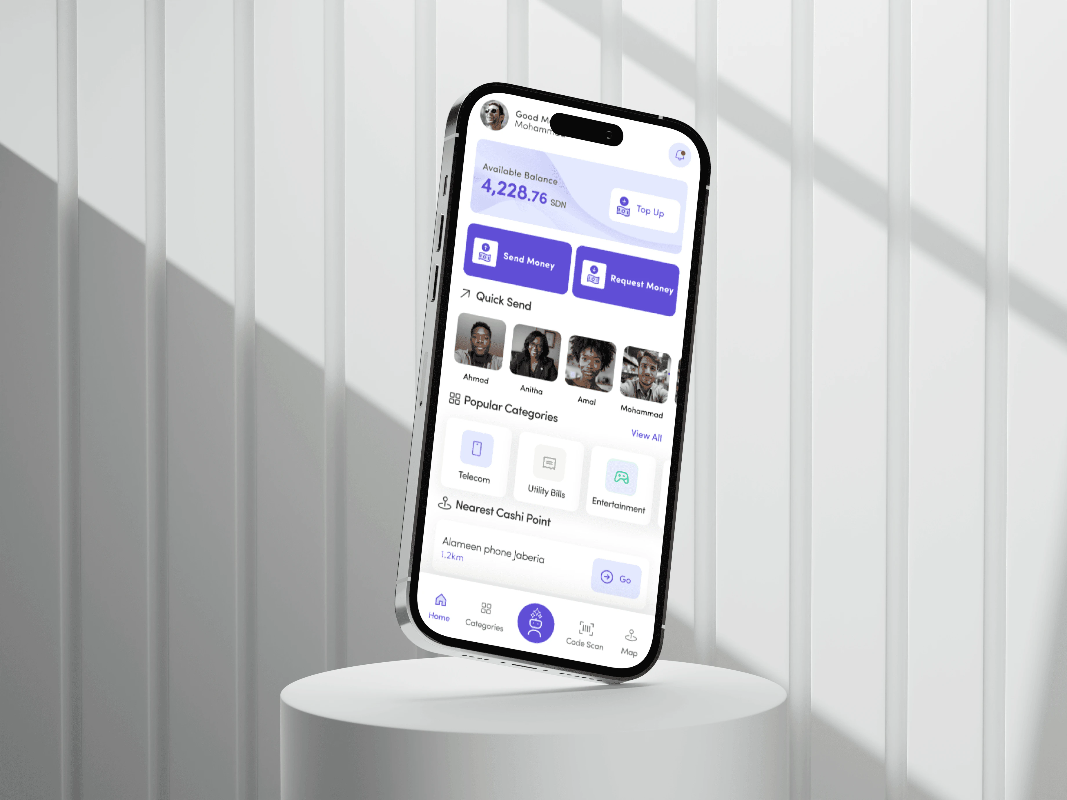
- The two jobs people open a wallet for, Send money and Request money, became the largest targets on the screen.
- Quick Send shows the people you pay most as photos, so choosing a recipient is recognizing a face, not reading a name.
- Ten-plus service tiles collapsed into a few clear categories.
- Clear icons, minimal text, and consistent spacing lower the effort of every screen.
Solution
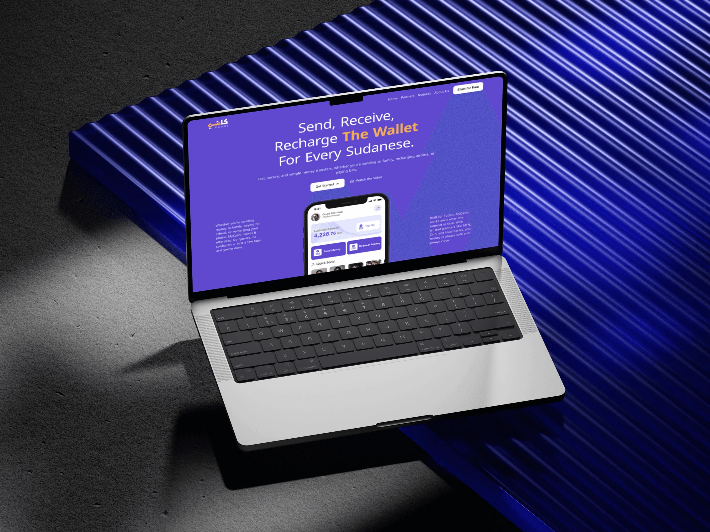
A single-screen home that holds everything that matters, with no scrolling, which also cuts data use. The landing page explains the wallet with the same visual language: big actions, faces, and very little copy.
Results
This is a concept, so the results are design outcomes rather than measured metrics:
- Faster person-to-person payments: fewer steps and less friction through centered actions and Quick Send avatars.
- Lower cognitive load: services grouped into categories instead of 10+ tiles.
- Usable without reading: icon-driven design and face recognition work for low-literacy users while staying light on data.