Problem
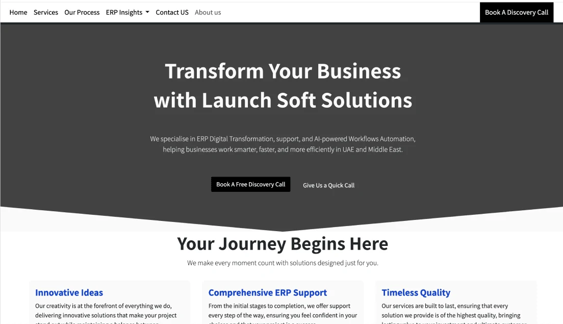
Launch Soft Solutions helps businesses in the UAE and the Middle East move onto Odoo ERP. Their old site did not say that clearly. The copy was generic, the objectives were unclear, low-contrast elements made the page hard to read, and the visuals did not follow the brand.
The cost showed up in the numbers: high bounce rates and very few people booking a discovery call. Visitors could not tell what Launchsoft sold, and the one action that mattered was easy to miss.
How I fixed it
Audit with evidence, not opinion
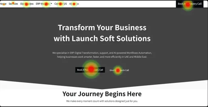
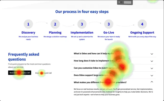
I ran a UX and UI audit using Plerdy heatmaps and AI-assisted analysis. Two patterns stood out:
- On the process and FAQ block, attention pooled on the questions and pulled focus away from the call to action.
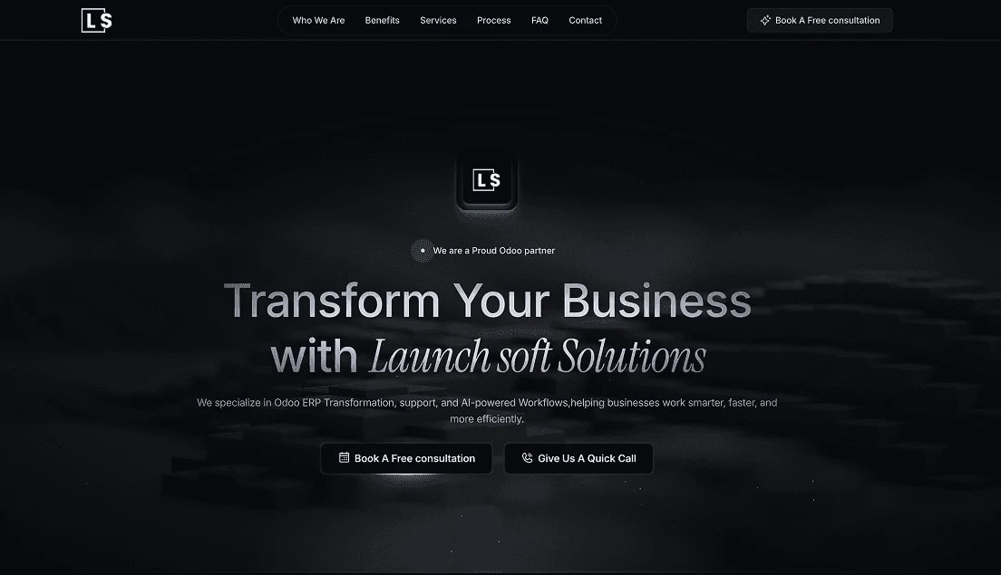
- In the hero, the primary CTA was competing with every other element for attention, and the overall UI felt dated.
Restructure before restyling
I prioritized the most critical issues by impact and rebuilt the main user flow as a sitemap where every section has one job:
- Hero: first impression and value proposition above the fold.
- Previous clients: social proof early, to build trust immediately.
- Offer: define what is being sold before selling it.
- Why choose us: answer objections before the visitor raises them.
- Services, features and benefits: tangible proof such as integration and data migration.
- Process: reduce friction by showing exactly what to expect.
- FAQ, then the call to action: close once trust is built, at peak intent.
Launchsoft landing page
9 sections / one path
- 01Hook
HeroCTA
First impression and the value proposition, above the fold.
- 02Trust
Previous clients
Social proof early, to build trust immediately.
- 03Offer
Offer
Define what is being sold before selling it.
- 04Trust
Why choose us
Answer objections before the visitor raises them.
- 05Proof
Our services
A broad overview of the service categories.
- 06Proof
Features and benefits
Tangible proof: seamless integration, data migration.
- 07Ease
Our process
Reduce friction by showing exactly what to expect.
- 08Ease
FAQ
Handle the remaining hesitations before the ask.
- 09Close
Call to actionCTA
Close once trust is built, at peak intent.
Solution
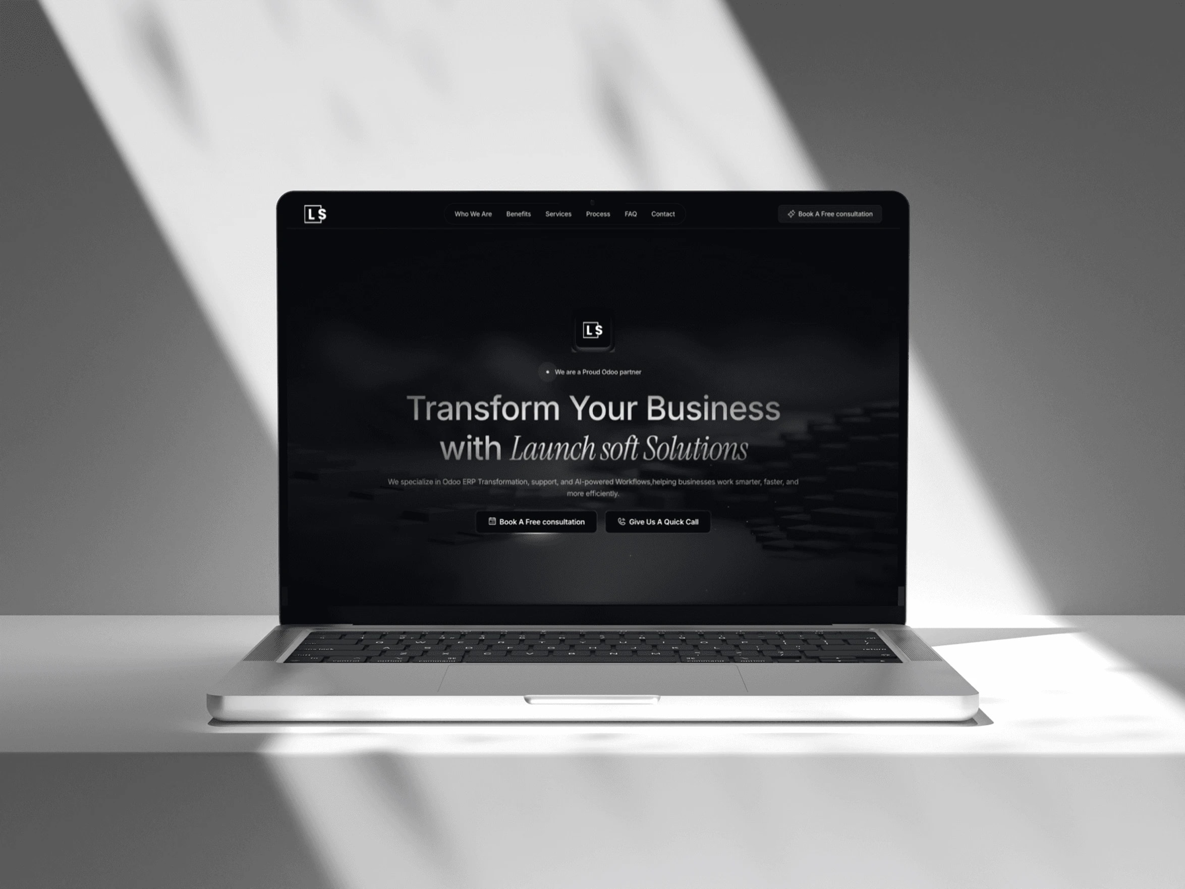
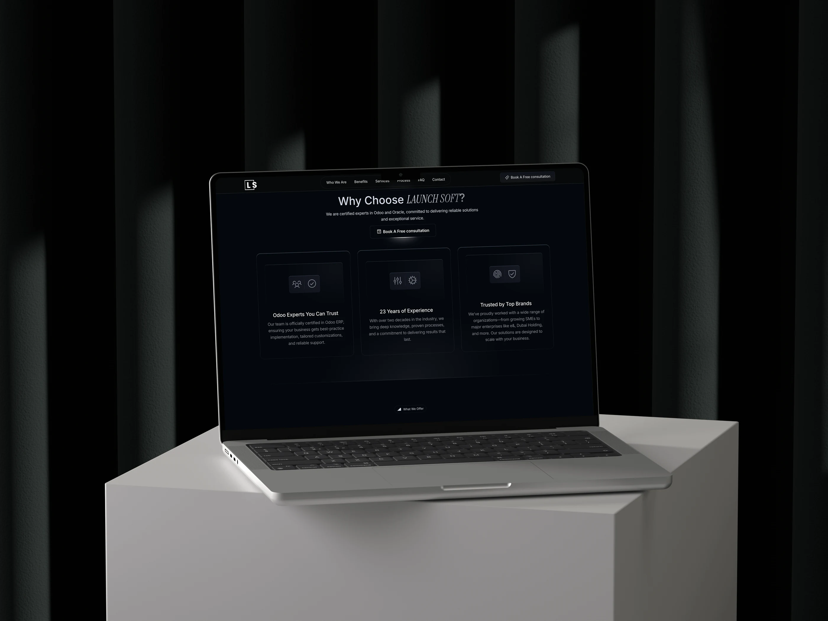
I redesigned the full site from scratch and built it in Framer: a dark, high-contrast interface on brand, with micro-animations that guide the eye instead of decorating. The CTA "Book a free consultation" now owns the hero, and the page walks the visitor from proof to offer to process before asking again.
Results
Measured over the first month after launch:
- 48% more demo requests.
- 62% improvement in time on page.
- 15% bounce rate.