Problem
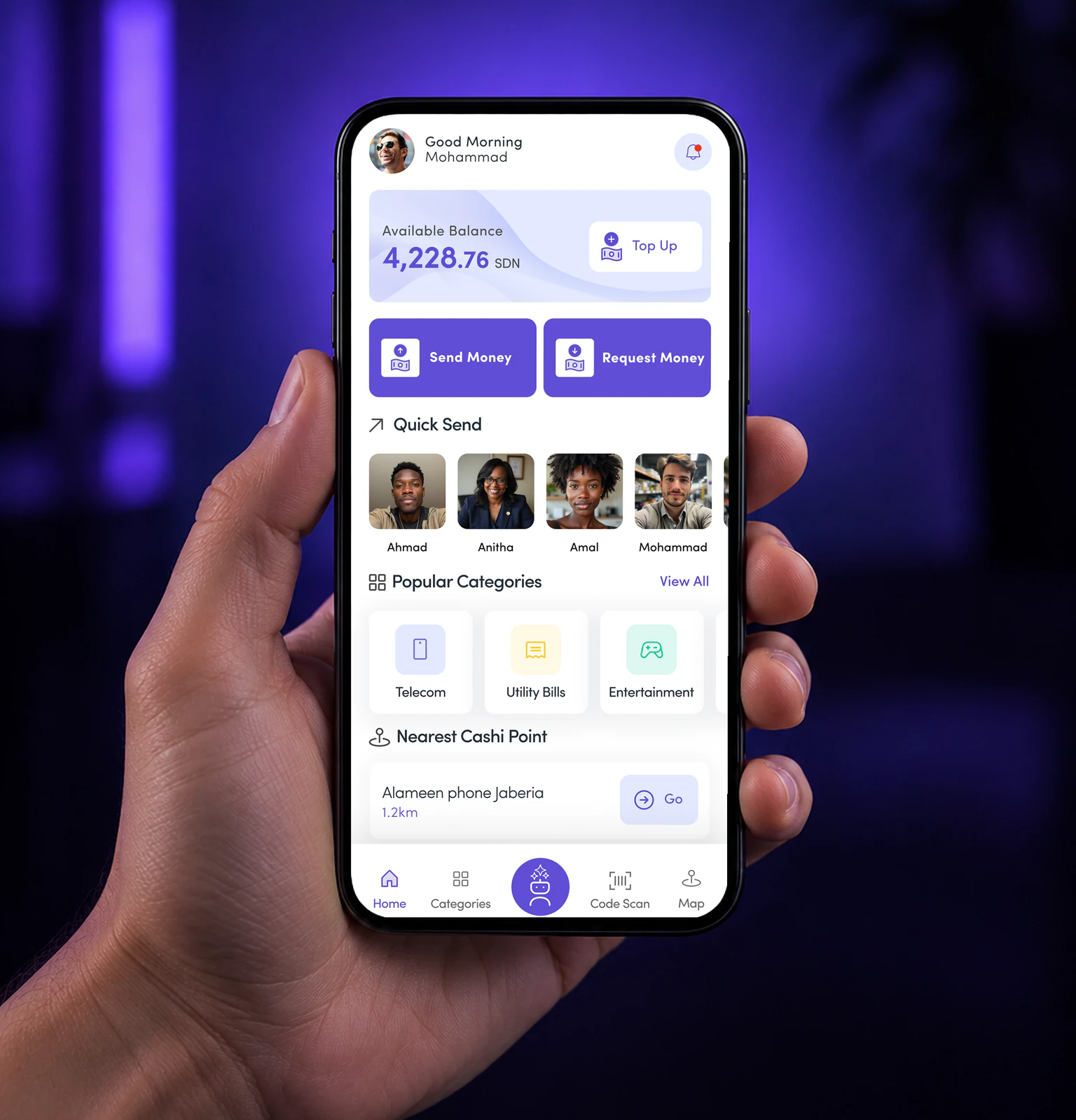
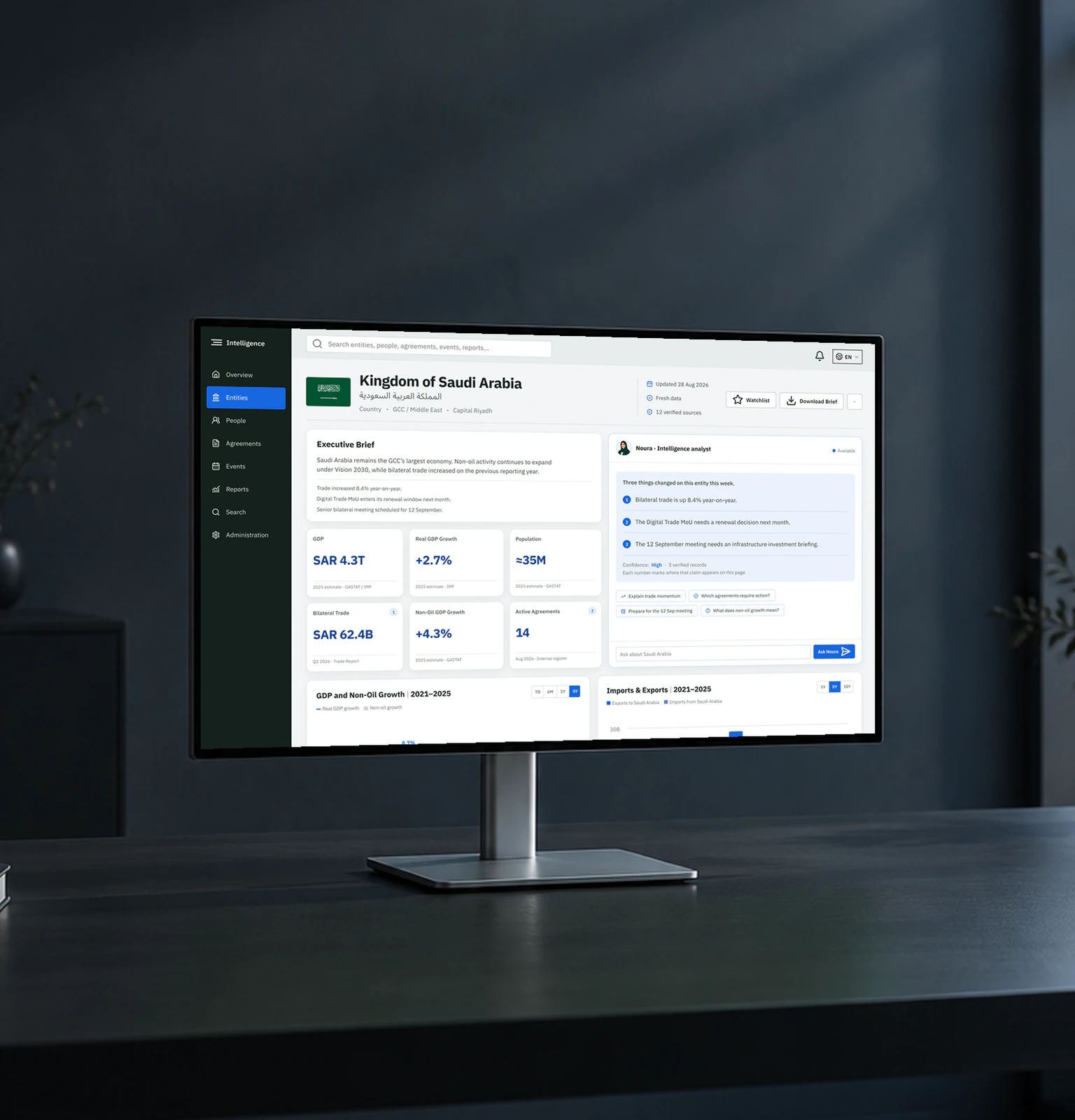
The KEZAD app serves very different people:
- A guest exploring what KEZAD offers.
- A company user running services and paying invoices.
- A user with limited access, waiting for approval.
- An owner with more than one company.
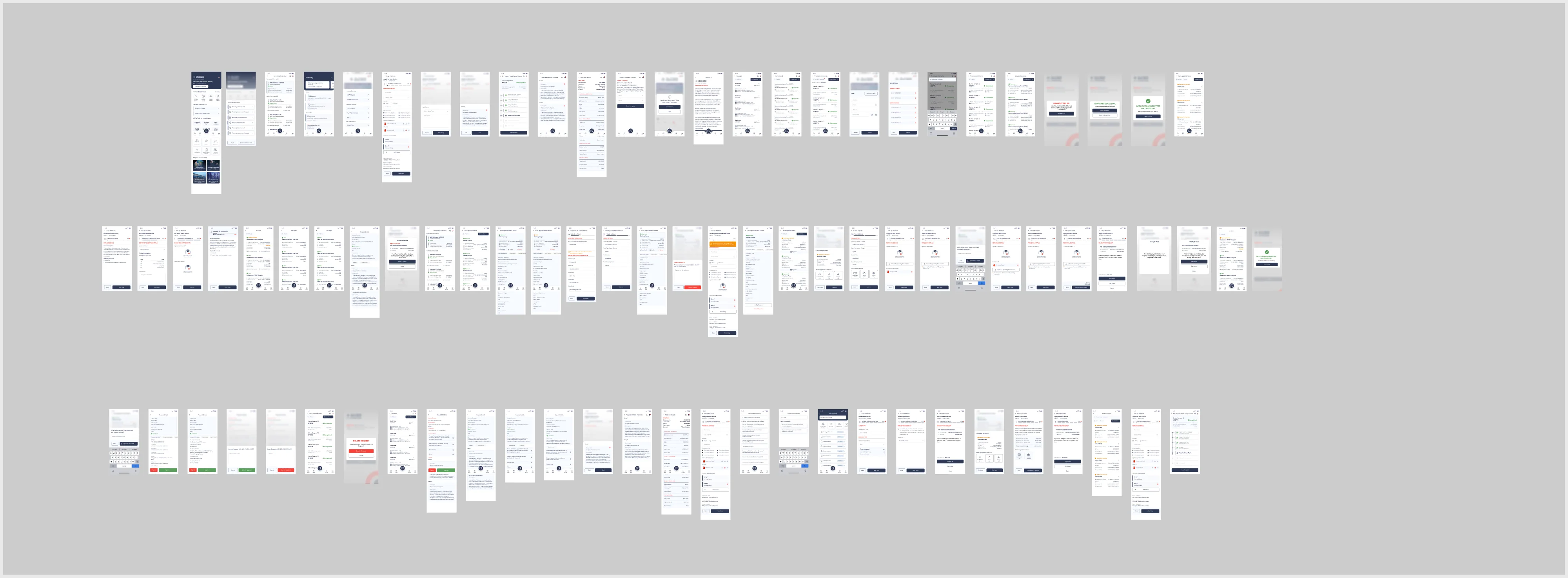
The old Adobe XD file mixed them all. It had about 265 frames, with no components, 58 icon sets and duplicate colours. Nothing said which screen belonged to which user.
How I fixed it
Map the users before the screens
I split the app into separate journeys, then designed each one end to end.
- Splash
- Continue as guest
- Guest home
- Explore KEZAD
- Enquire
- Track enquiry
- Sign in
- MFA
- Home
- Start a service
- Track
- Pay
Why this, not that
Chose
A guest tab bar of its own
NotMember navigation with locked items
Guests get News, Menu and Guest support. No dead tabs, and no sign-in wall on every tap.
Chose
Limited access as a state of Home
NotAn error screen
A user waiting for approval sees why, and gets one clear action: submit an enquiry.
Chose
Switch company inside the profile
NotSign out and back in
Pick individual or company, then the company. One account, many trade licences.
One system under every flow
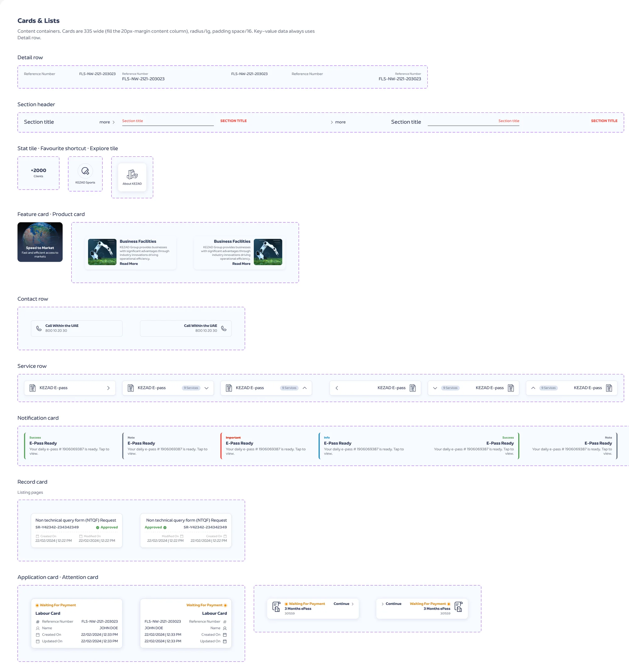
52 components with 363 variants in English and Arabic, 129 Phosphor icons in place of 58 legacy sets, and 116 variables.
Solution
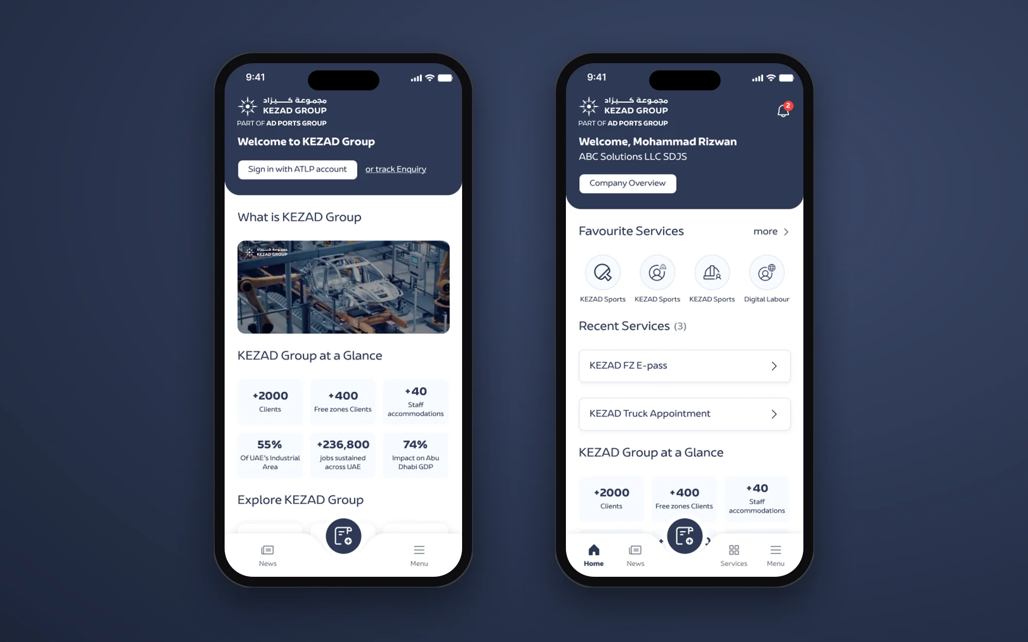
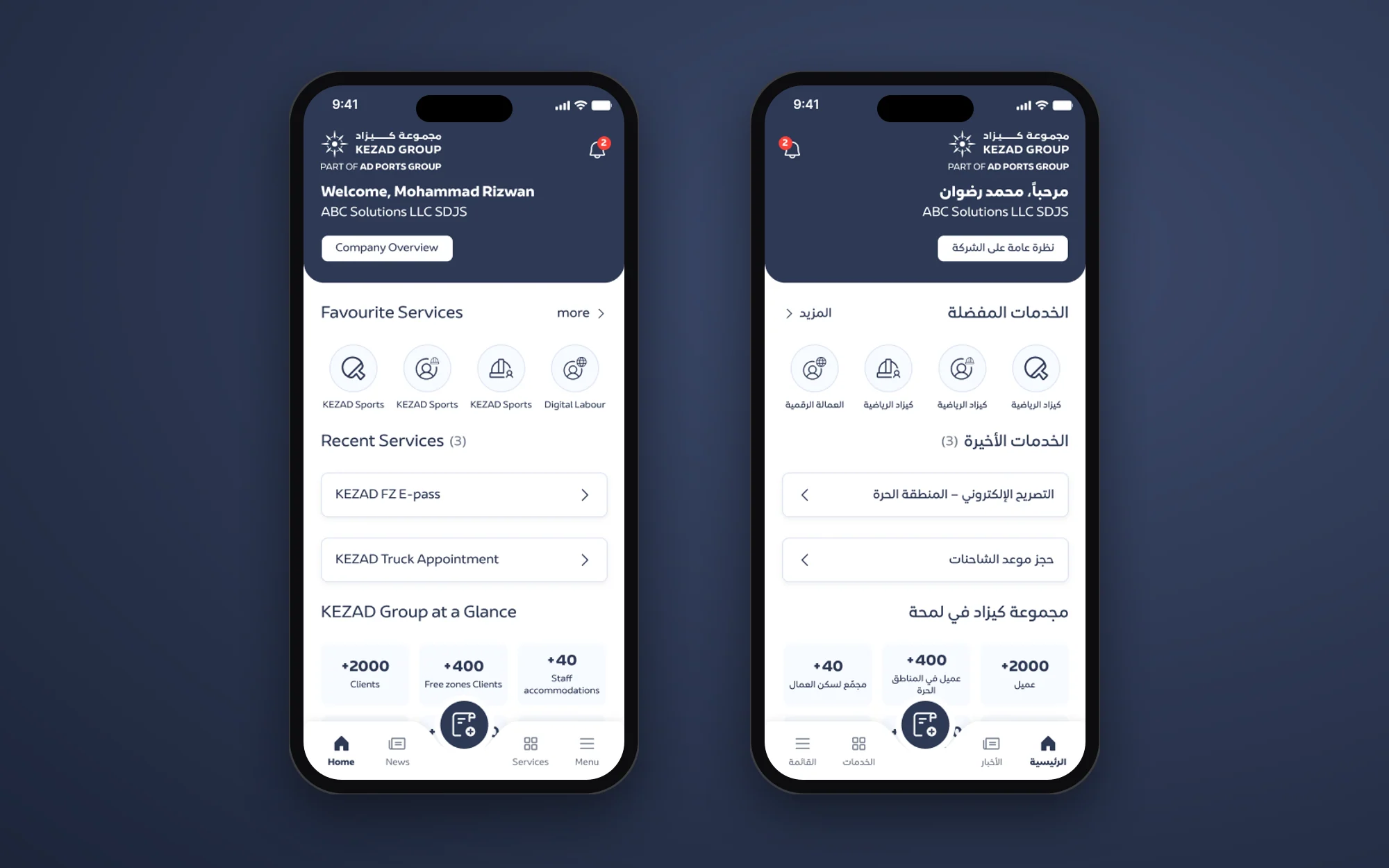
Counts from the final Figma file, October 2026
Results
- Every user type has a path. Guests, members, limited users and multi-company owners each land on a home that fits them.
- The team can present any journey from one file, from the first splash screen to a failed payment and its retry.
- Arabic is ready. 15 key screens are already built right to left from live components.