Problem
A senior official has between ninety seconds and five minutes with this screen before the day takes over. In that time they need to know what is urgent, what needs their decision, and what they can hand off.
Most executive dashboards fail this person in two ways: they show everything at the same volume, and they hide the AI behind a chat button that nobody opens.
How I fixed it
Arabic first, by design
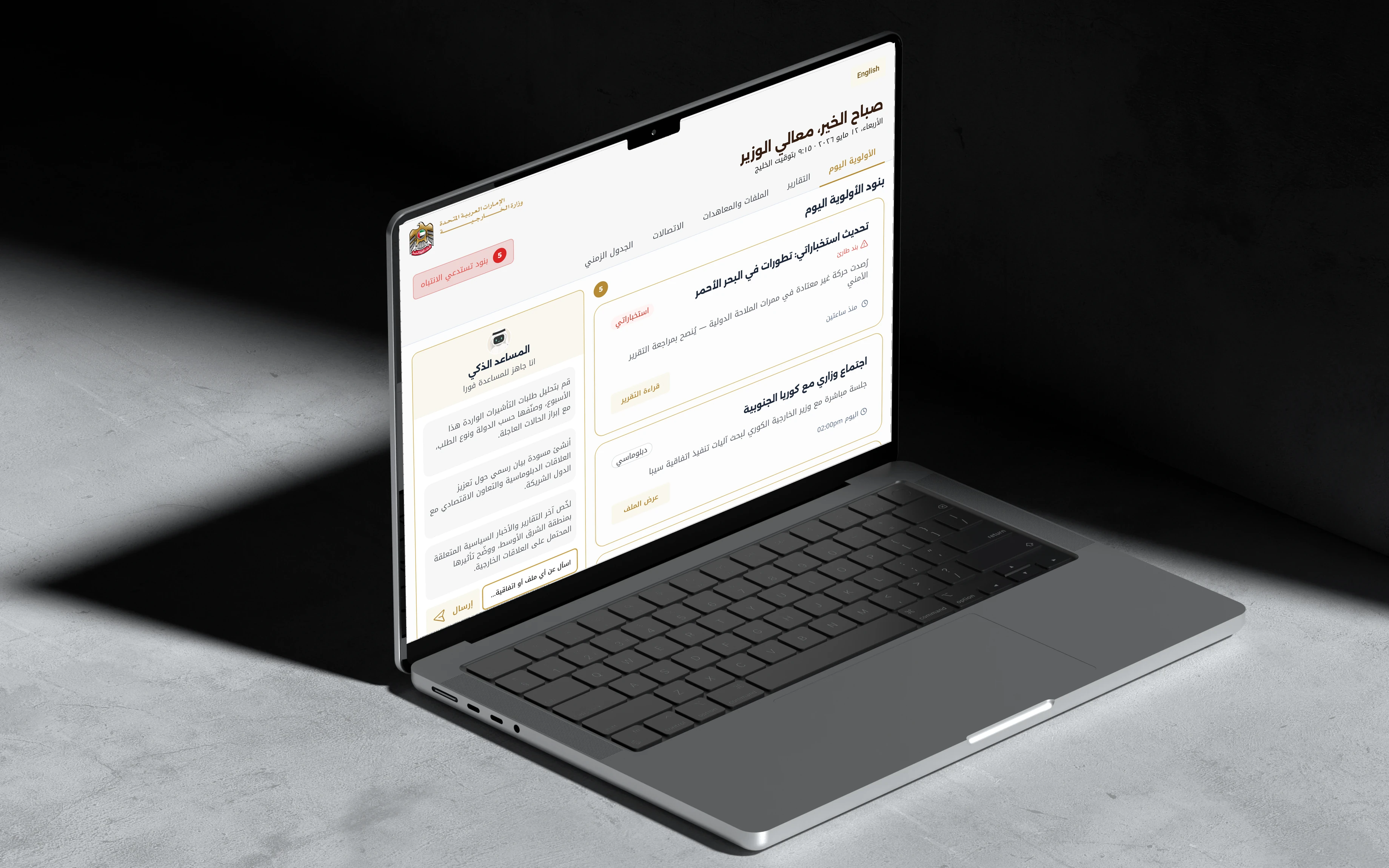
Arabic is the primary language, so I designed the reading path for right-to-left first. The priority list starts at the right edge, where the eye lands. After scanning it, the eye moves left and arrives at the assistant without any extra movement.
The AI panel is never between the user and the data. It is reached after the data, never before it. The English build mirrors the same logic: priorities on the left, assistant on the right.
Why this, not that
Chose
A fixed AI column
NotA floating chat button
A floating button says "optional". A fixed column says "part of the system". For someone with ninety seconds, the difference between a visible tool and a hidden one is the difference between use and non-use.
Chose
One filled button on the whole screen
NotEvery action at the same weight
Generate Executive Briefing is the only filled, coloured button. Below it sits the assistant's Send, then each item's own action. Three tiers, and none can be mistaken for the one above it.
Chose
A query, scoped to ministry data
NotA general search or chatbot
The input asks "Ask about a file or agreement". Search returns results; a query returns an answer with attribution. Answers here are sourced, bounded and logged.
Chose
Suggested tasks from today's work
NotGeneric prompt ideas
The suggestions are real ministry jobs: classify this week's visa requests, draft a statement, summarise regional reports. They teach what the assistant is for.
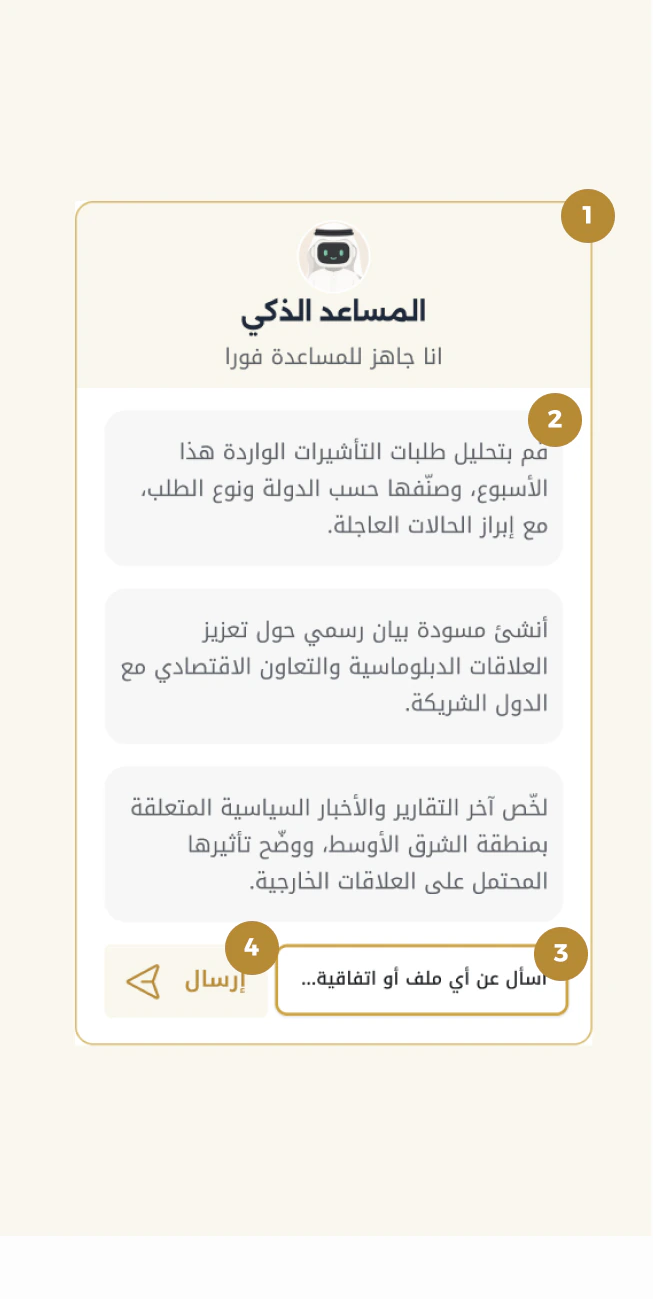
- 1
Persistent
A fixed column, not a popup. No tap to reveal, no state to remember.
- 2
Suggested tasks
Context-aware jobs from this week, not generic prompts.
- 3
A scoped query
Ask about a file or agreement. Answers come with attribution.
- 4
Send stays secondary
Styled as part of the input, so it never competes with the page's primary action.
Solution
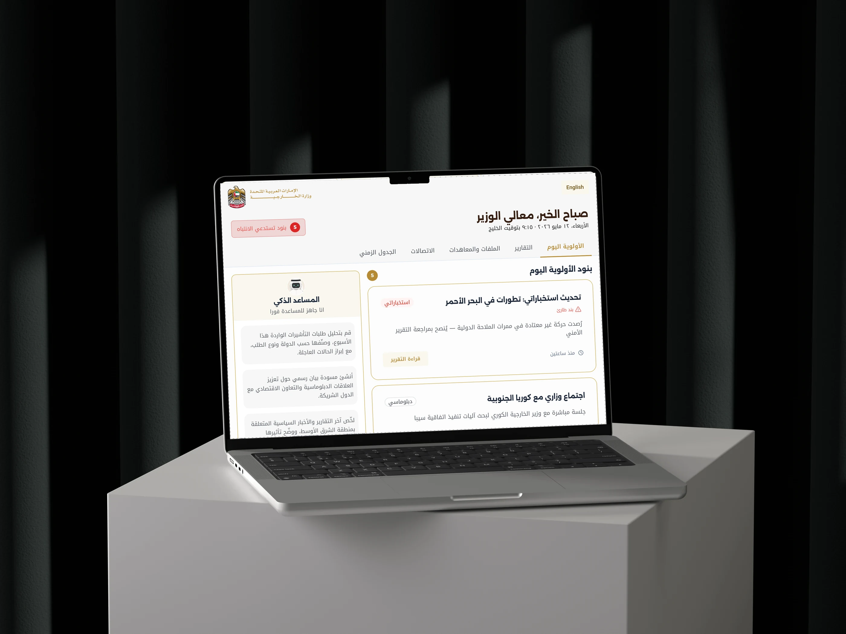
Every priority item carries a type, a time, and exactly one action, so a decision never needs a second screen. Flagged relationships sit below as a weekly watchlist, and Export & Share keeps a secure trail of what left the building.
Results
A concept built on fictional data, so these are design outcomes rather than measured results.
Briefing figures are part of the fictional scenario.
Next, I'd test the reading path with officials who read Arabic first: does the eye really arrive at the assistant after the list, and does a fixed column get used more than a button would?